Theming Overview
A theme in Paper is used to ensure consistency across your app without the need to style every single component from scratch each time you use them.
Theme Panel

The Theme Panel is the place where you can customize the colors and corner radius of components used in your app.
Here is what a theme consists of:
Colors
Colors in a theme define the visual aesthetics of interactive elements, backgrounds, and text. A theme typically includes several color attributes that target specific UI components. The main categories of color attributes are:
- Primary Color: The main color used for key interactive elements, like buttons and icons.
- On Primary Color: The color used for text or icons placed on top of the primary color.
- Secondary Color: Used for secondary actions or elements, often with less emphasis than the primary color.
- On Secondary Color: The color used for text or icons placed on top of the secondary color.
- Background Color: The background color for all screens in your app.
- On Background Color: The color of text/icons placed on the background.
- Surface Color: Used for surfaces like cards, app bars, and other UI elements.
- On Surface Color: The color for text/icons placed on surfaces.
- Destructive Color: Used for elements that indicate critical actions like deleting or canceling.
- On Destructive Color: The color for text/icons on top of destructive-colored elements.
- Outline Color: Used for borders or outlines of elements like outlined buttons.
Corner Radius
Corner radius controls how rounded the edges of UI elements are. A higher radius creates a softer, rounder look, while a lower radius results in sharper, more defined corners.
The corner radius can be applied to various elements such as buttons, cards, and input fields.
Text Styles
Text styles define how text should appear across the app. This includes properties such as font size and weight. There are 6 available text styles to choose from:
- Large Title: For large headings, typically used for main section titles or important headings.
- Medium Title: For smaller headings, suitable for subheadings or secondary titles.
- Small Title: For the smallest headings, often used for captions or minor titles.
- Large Body: For larger body text, typically used for paragraphs or key content.
- Medium Body: For standard body text, suitable for the majority of the content in the app.
- Small Body: For smaller body text, often used for fine print, footnotes, or supplementary content.
How to update your text styles
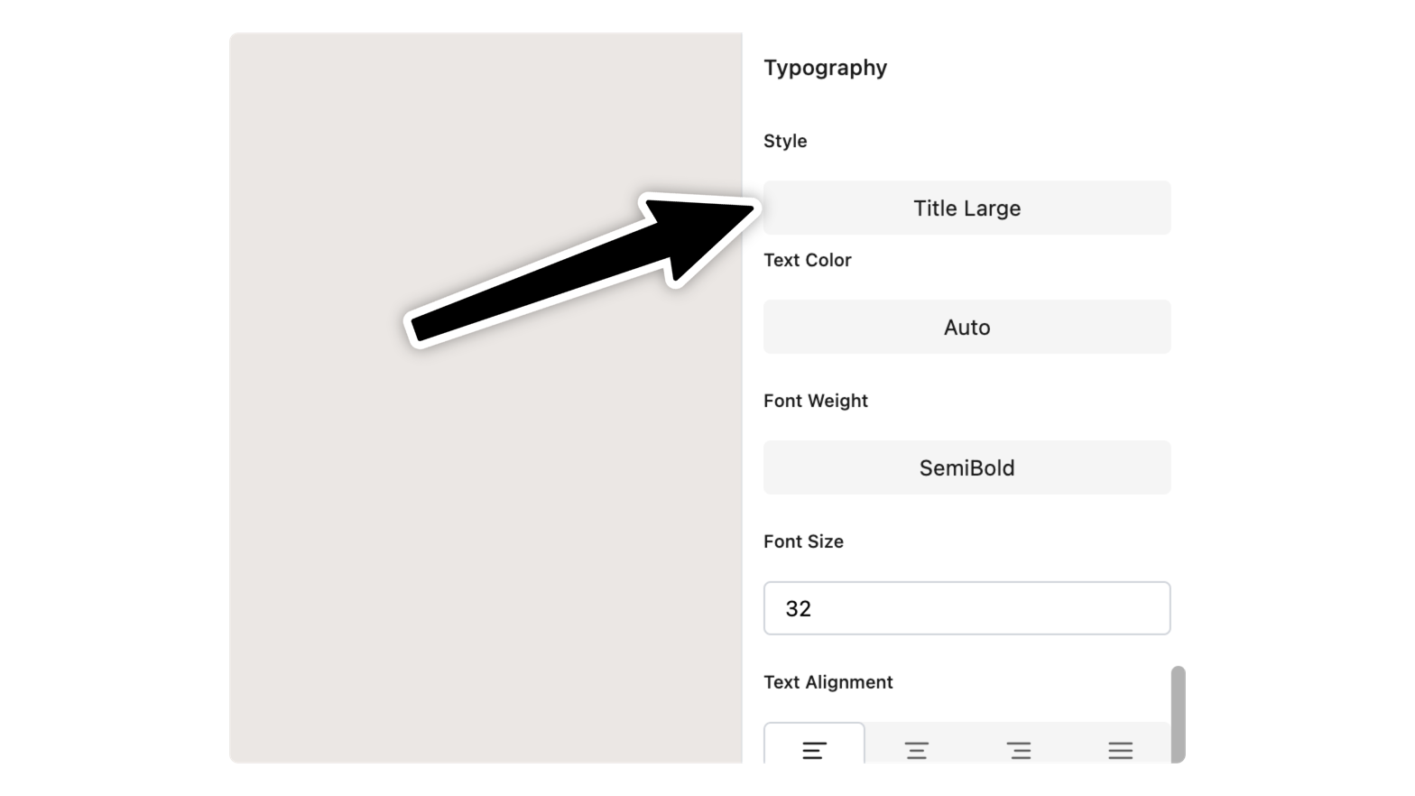
Select any text your want to apply the text styles to. Then from the Properties Panel, scroll to the Typography properties and choose the style you want.
Any change you do will automatically update the current style.
Styled Components
Components such as Buttons and Cards already use the theme you define. This means that when you update your theme, the appearance of these components will automatically adjust to reflect the new colors, corner radius, and text styles. This integration allows you to quickly change the look of your app without needing to manually update each component individually.
