Buttons
Buttons communicate actions that users can take in a given screen.
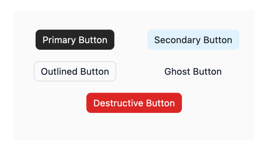
Paper comes with 5 different types of pre-styled buttons, which adapt to your app's Theme by default.
Default Properties
Every component has a set of default properties on top of their specific ones.
