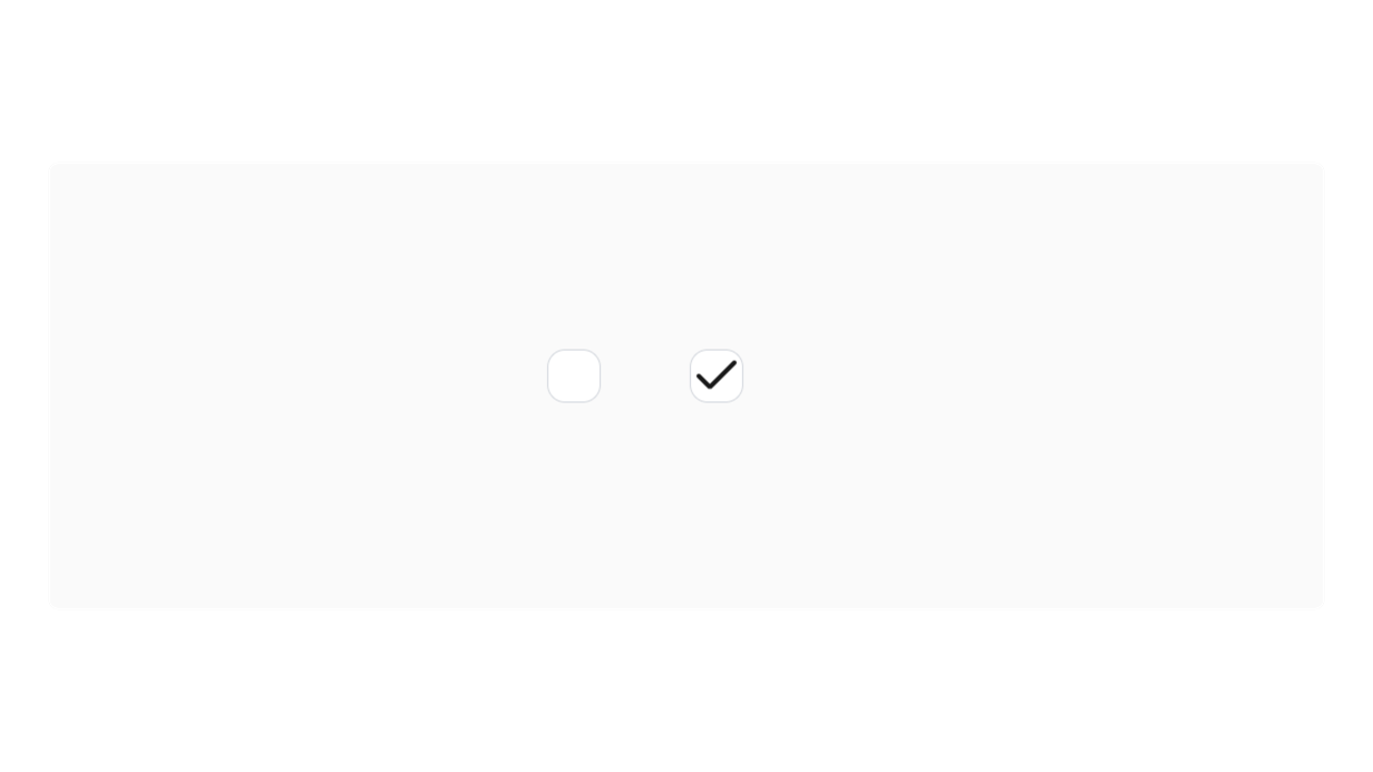
Checkbox

Checkbox Properties
Selectable
| Selected | Indicates whether the element is selected or not. |
| Selected Color | The color used to highlight the selected element. |
Default Properties
Every component has a set of default properties on top of their specific ones.